Intelligence marketing et revenus pour
les équipes ambitieuses de toutes tailles
Nous créons une plateforme qui donne aux entreprises leaders les insights nécessaires pour prendre des décisions qui augmentent les revenus, améliorent l’efficacité et renforcent la confiance dans leurs stratégies GTM
About Heeet
Heeet is the marketing intelligence layer for your CRM. It connects every marketing touchpoint to pipeline and revenue, maps the full customer journey, and gives teams and AI the context they need to make better go-to-market decisions.
Heeet runs natively inside Salesforce and HubSpot, and works with any CRM, including Pipedrive, Zoho, Dynamics 365 and Attio, through the Heeet Platform.
Founded in Paris in 2020 by Thomas Sevège, Romain Blanc and Maxime Rat.
Naming
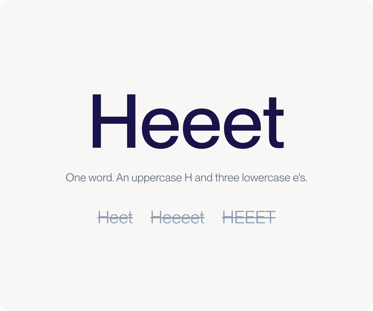
Heeet is spelled as one word with an uppercase H and three lowercase e's. It names both our company and our product. Never write Heet, Heeeet or HEEET. The all-lowercase heeet belongs to the wordmark only.
Heeet is pronounced [pronunciation to confirm].
Capitalise the names of Heeet products, such as Heeet for Salesforce, Heeet for HubSpot, Heeet Platform, Heeet Analyst Agent and Heeet Lead Intelligence. Keep capabilities within a product lowercase, such as multi-touch attribution, buyer journey analytics and offline conversion tracking.
Wordmark
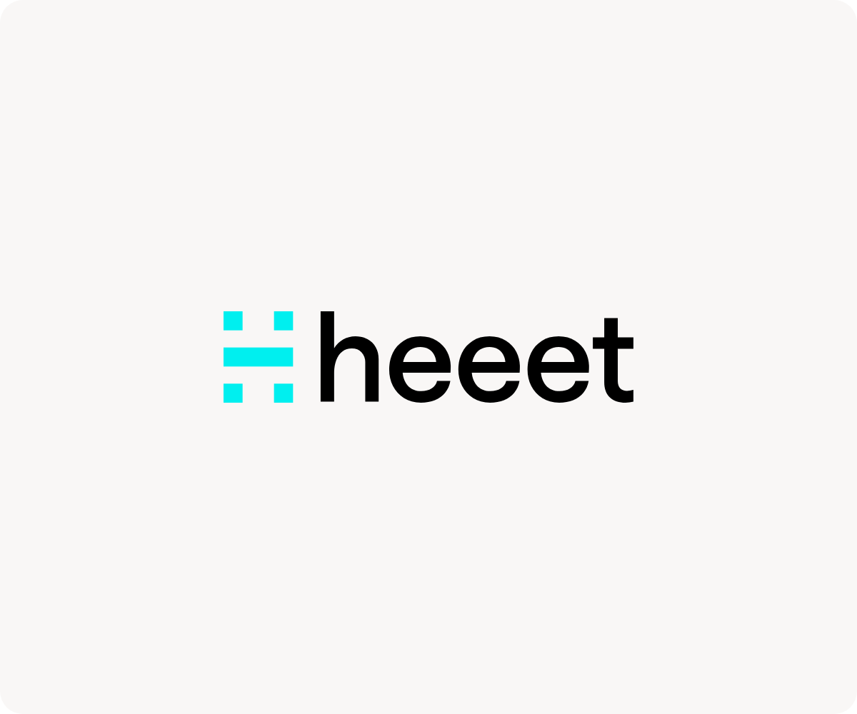
The wordmark is the most recognisable form of Heeet's brand. Use it by default wherever the layout allows. It pairs the H-mark with the heeet letters: do not use the letters without the H-mark, and do not typeset the name in place of the wordmark.

Logo
The H-mark is the visual shorthand for our brand. Use it where space is limited and the wordmark cannot breathe, such as avatars, app icons, favicons or logo grids. Keep clear space around it, and do not warp, stretch, recolour or redraw it.

Clear space and minimum size
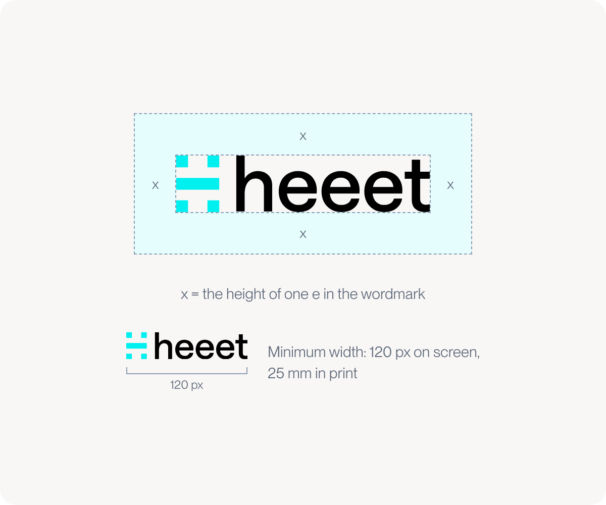
Give the wordmark room: keep a clear space at least the height of one e on every side, and let no other text or graphic enter it. Never show the wordmark narrower than 120 px on screen or 25 mm in print. When space is tighter, switch to the H-mark.
Logo pack
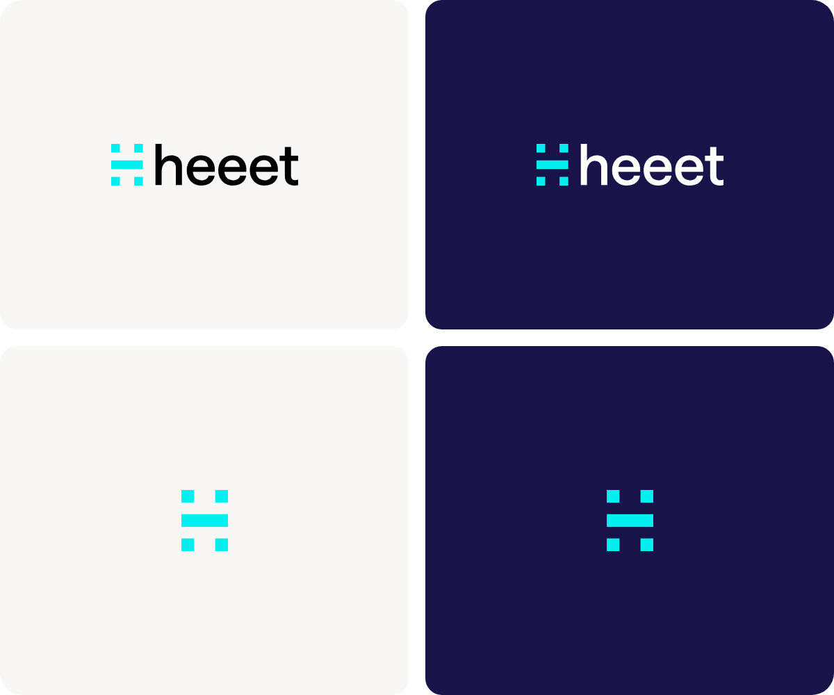
The logo pack contains the wordmark and the H-mark as SVG and PNG files, in light and dark variants. Use the Original version, with dark letters, on white, beige and light photography, and the Reverse version, with white letters, on navy and dark photography. The H-mark stays cyan on both. There are only these two versions; never create a third.
Logo misuse
Always use the files from the logo pack exactly as supplied. Do not warp, stretch, recolour or redraw them.
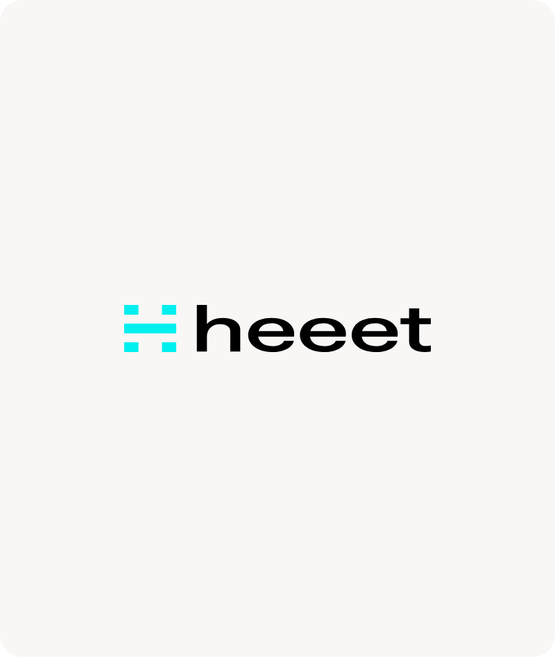
Don't stretch the logo.
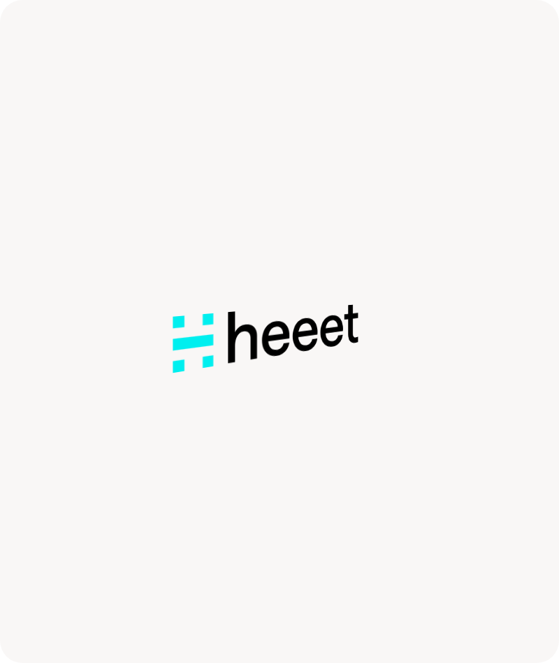
Don't warp the logo.
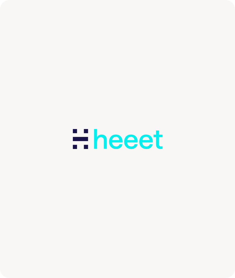
Don't recolour the logo.
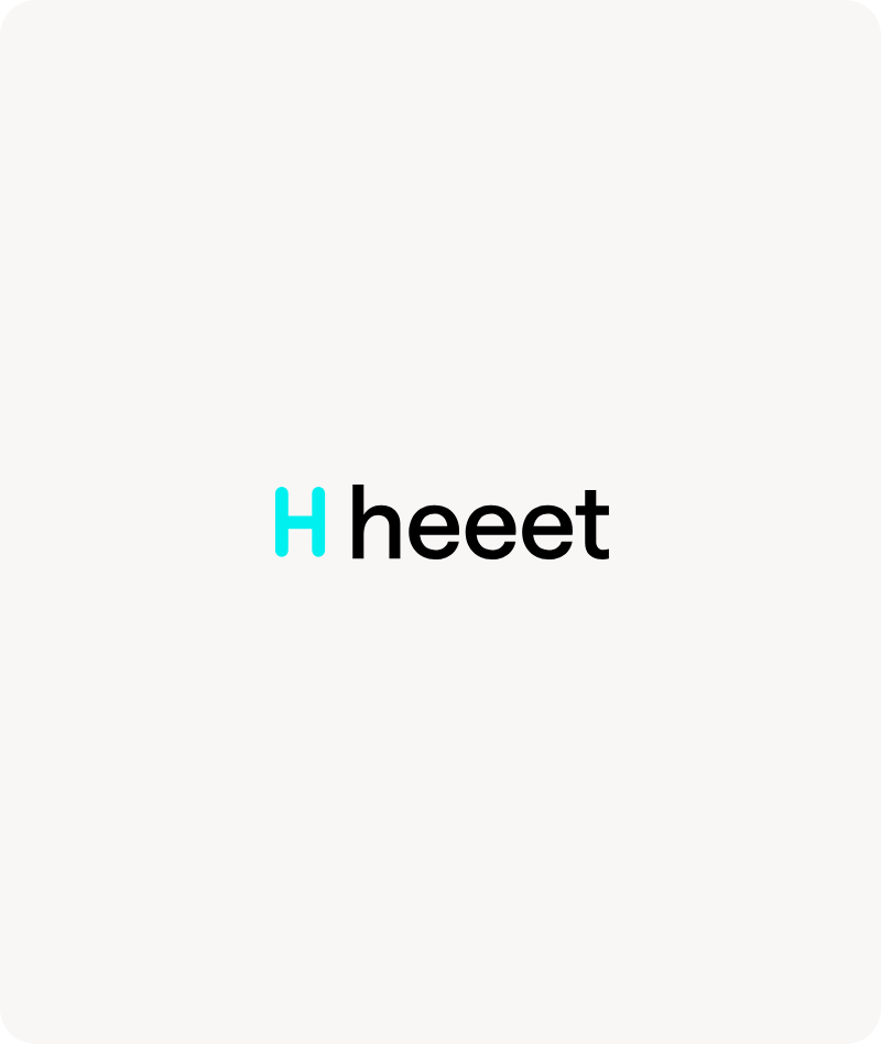
Don't redraw the H-mark.
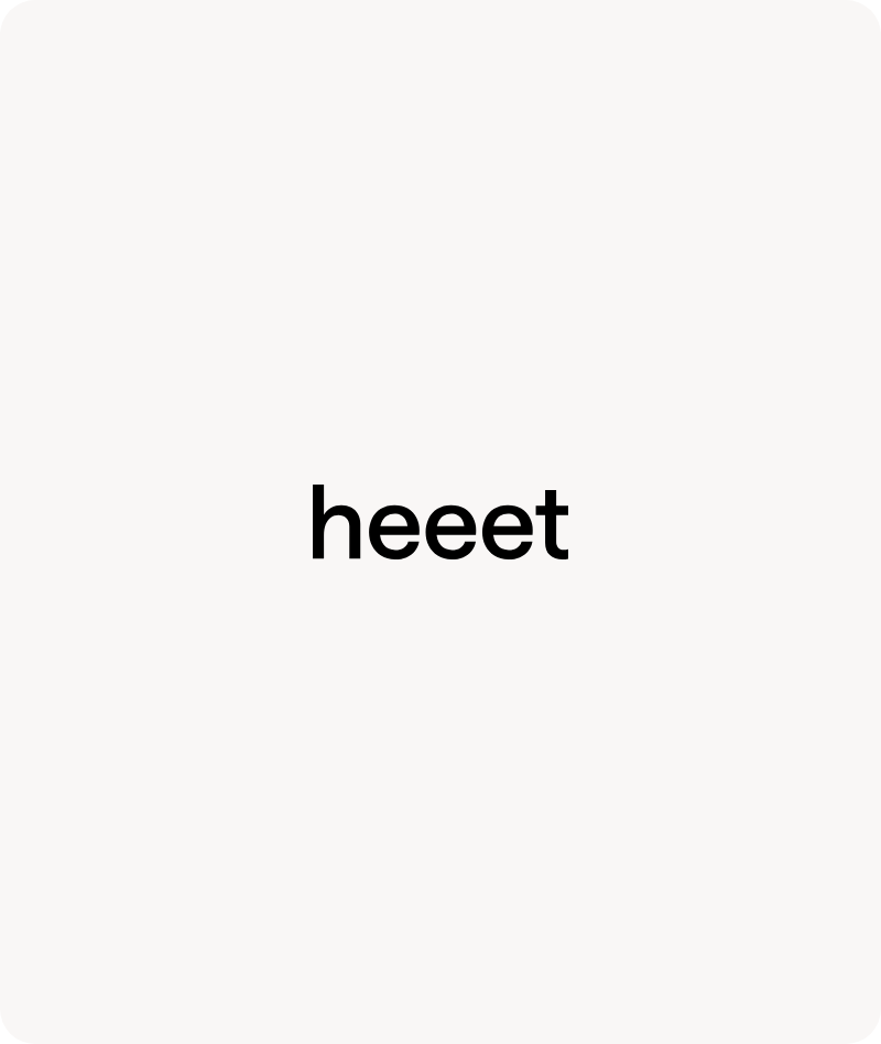
Don't use the letters without the H-mark.
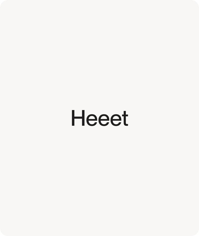
Don't typeset the name in place of the wordmark.
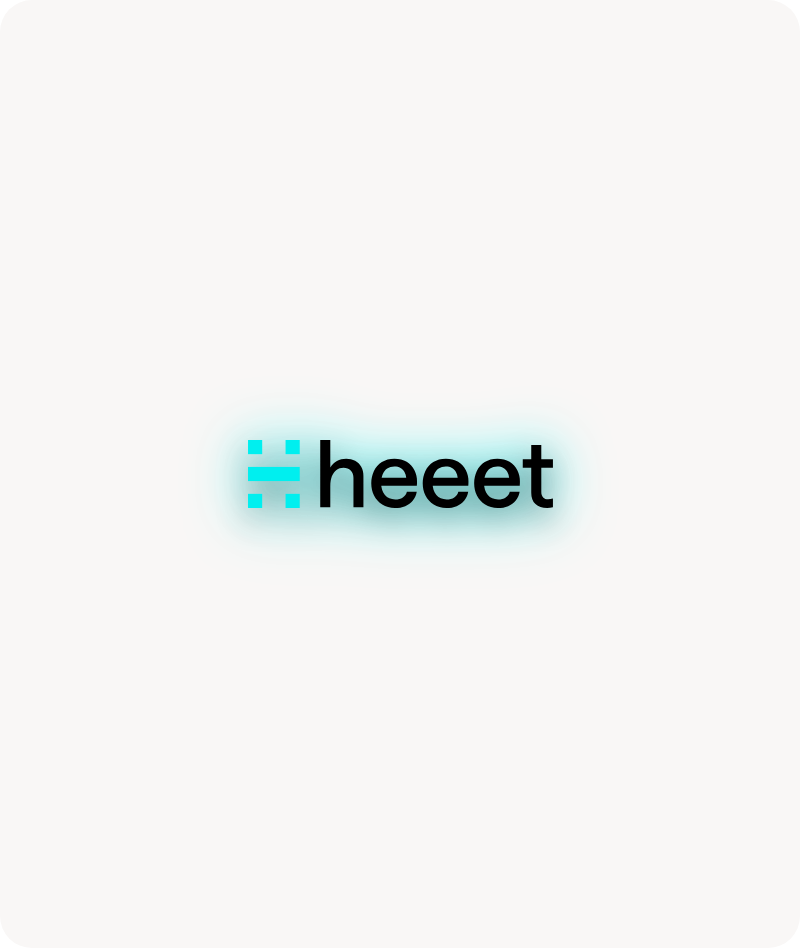
Don't add shadows, glows or effects.
Don't put the Original version on dark backgrounds.
Colour
Heeet is navy, cyan and calm neutrals. Surfaces alternate between white, light beige and navy, so each section reads as a fresh paragraph.
Cyan is the only accent. Use it for the H-mark, primary buttons and emphasis, never as a card or page background. The lighter cyans are reserved for charts and diagrams.

Heeet Navy
#181349
RGB 24, 19, 73
Dark surfaces and headings

Heeet Cyan
#00EFEF
RGB 0, 239, 239
Accent only: H-mark, buttons, emphasis

Light Beige
#F9F7F6
RGB 249, 247, 246
Warm secondary surface

White
#FFFFFF
RGB 255, 255, 255
Primary page background

Ink
#1F1D1E
RGB 31, 29, 30
Body text

Slate
#5D6878
RGB 93, 104, 120
Paragraph text

Cyan 500
#00D2D7
RGB 0, 210, 215
Charts and diagrams

Cyan 100
#BCFAFA
RGB 188, 250, 250
Charts and diagrams

Cyan 50
#E6FDFD
RGB 230, 253, 253
Charts, diagrams and tints
Typography
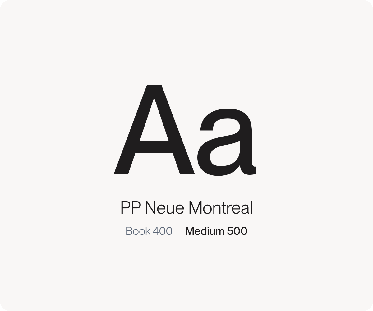
PP Neue Montreal carries everything, in two weights only: Book for text and most headings, Medium for the largest headings. Hierarchy comes from size and colour, never from bold. Set type in sentence case with no letter spacing, keep uppercase for small labels, and emphasise with cyan, not weight. PP Neue Montreal is licensed from Pangram Pangram; if you don't hold a licence, use Arial.


Platform
Resources
Company
Compare
Free Tools
Features
Industries